 Book a free autopsy











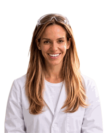
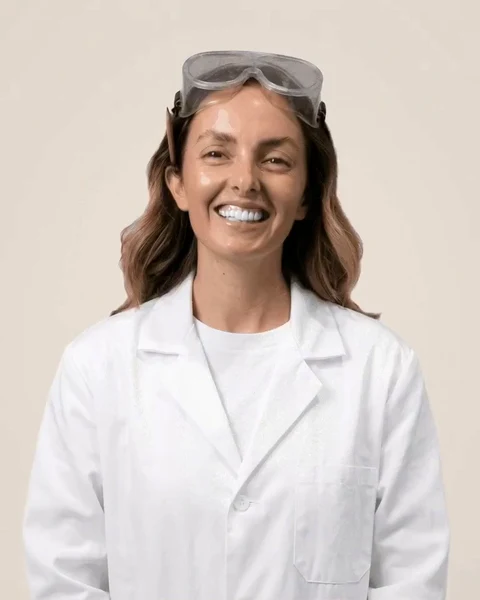








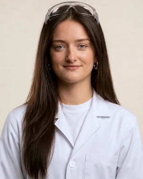











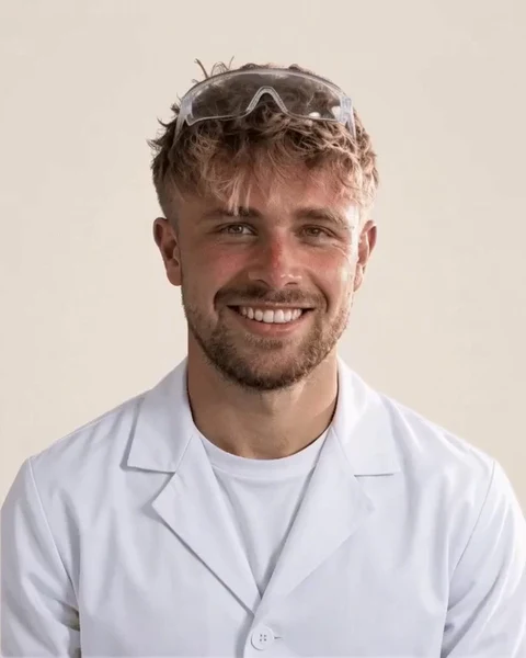






















































































The brand kit · for the team and clients
The brand kit. Make anything, in the lab’s colours.
The colours, the type and the few rules, then all 34 assets: pick one, change the words and colours, download it.
Set yourself up first.
Your profile photo, LinkedIn banner, email signature and video-call background, each already filled in with your name, in order.
The rules. Short ones.
Colours
#F8D0CBPowder#C5DCF2Mint#C6EBD6Butter#F8EAAALilac#DDD0F4Paper#FBF7F0Ink#1F1A16Brown#6B4429Cocoa#5B4636Biro#1446B4Stamp#A8352COne pastel per piece, on paper, outlined in ink. Never a colour from outside this list.
Type
Big Shoulders Display
Instrument Serif, for the aside.
Archivo, for everything you read.
JetBrains Mono · labels and small print
Headlines in capitals, short. In email, where these fonts can’t travel, the signature uses fonts every inbox already has.
Words
- Figures come from the live numbers, never typed from memory: the kit marks every figure as a placeholder until you fill it in.
- The joke is the pharmacy, not the client. Never a real client’s name or result without their yes.
The whole kit. Search it, open one, make it yours.
Every post, story, banner, card and background we use. Open any of them to change the colour, words, size and photo, then download it.
The brand guidelines. Everything, written down.
The name, the logo, the colours, the type, the pills, the photos, the voice and the rules for every figure. This is where they live: any tool that needs them reads the same words from the files below.
The name
We are
On steroids
Retired
Legal entity only: Solar on steroids Ltd
- We are On steroids. Capital O, lower-case s, two words, in every sentence, caption and title.
- "Solar on steroids" is retired (Jude, 3 Nov 2026): everything moves to On steroids, for every trade we work with.
- The one exception is the legal entity, Solar on steroids Ltd (company number 15845416), written in full wherever the law asks for it: contracts, invoices, the small print, the footer's entity line.
- In display type the name is set in capitals (ON STEROIDS) because the headline face is. In running text it is never ALL CAPS, and never "On Steroids".
- On artwork, the web address is onsteroids.com, as the lockup with the web address carries it.
What we do
On steroids is a UK marketing agency for home installers: we film your real jobs, run them as Facebook and Instagram ads, qualify every lead with a quiz, and count cost per sale, not per lead.
- VideographyFilmazepamFour shoots a year on your real jobs, with your fitters and your vans.
- Facebook adsMetabolVideo ads on Facebook and Instagram, cut from your own jobs. Fresh creative every week.
- FunnelsFiltrazineA quiz qualifies every lead before it reaches your phone. Tyre-kickers fail it.
- TestimonialsReviewazolReviews, customer videos and proof on every ad, so homeowners believe you before you knock.
- DataDatacillinEvery sale in your CRM fed back to Facebook, so it finds buyers, not clickers.
Logo
- The mark: our symbol, drawn as one shape. It stands alone only where the name is already said: a profile picture, a favicon, a film watermark.
- The wordmark: ON STEROIDS in Big Shoulders Display Black, drawn as outlines so it never depends on the font being installed.
- Keep clear space of at least 50% of the logo's height on every side; the kit's files on a solid ground are cut with exactly that.
- Never smaller than 16px tall for the mark on screen, the size the site's own phone menu draws it.
- Use the SVG wherever a tool takes it, the PNG anywhere else. Every version is in the kit, under Logo files.
Never
- Stretch, squash, tilt or rotate it.
- Recolour it outside its versions: ink, white, paper on ink, or the mark in brown.
- Set the name in another font, or retype it in the display face: use the files.
- Add a shadow, outline, glow or gradient.
- Put it on a busy photo where it cannot be read: use the white version on a dark, calm area, or a solid ground.
Colour
- Paper and beige, five pastels that belong to the five pills, brown for anything you press, blue biro for anything written by hand.
- One pastel leads a piece. A service or a trade always wears its own pastel.
- Every colour comes from this list. Nothing else, no tints of your own, no gradients.
- Each pastel has a darker edge: the pressed side of a pill or tablet and the mark inside it. It is never a fill for big areas and never text.
The five pastels
#F8D0CBedge #D9817AOne per piece. Worn by Videography and Heat pumps.#C5DCF2edge #5F8FC2One per piece. Worn by Facebook ads and Aircon.#C6EBD6edge #5FAE87One per piece. Worn by Funnels.#F8EAAAedge #CFAE2EOne per piece. Worn by Testimonials and Solar.#DDD0F4edge #9580CCOne per piece. Worn by Data and Windows.Neutrals
#FBF7F0The page. Everything sits on paper.#FFFDF9Cards, labels and the white half of a capsule.#F5EDE1Panels and wells behind artwork.#ECE2D3Quiet fills: a disabled button, a placeholder.#DCD0BFHairlines and dotted dividers.#1F1A16Headlines, outlines, hard shadows and the text on any pastel.#5B4636Body copy and ledes.#7C6C5DCaptions and small print, on paper or white only.Press
#6B4429Anything you press: the primary button.#45291AThe pressed edge of brown.Marks
#1446B4Anything written by hand: notes, arrows, underlines, placeholders still to fill.#A8352CRubber stamps: Hiring, Case study, Recalled.#1F7A4AThe Approved seal, and nothing else.Who wears which pastel
- Videography
blush - Facebook ads
powder - Funnels
mint - Testimonials
butter - Data
lilac - Solar
butter - Windows
lilac - Heat pumps
blush - Aircon
powder
Contrast, measured
- Text on a pastel is always ink.
- Body copy is ink or cocoa on paper or white. Muted is for small print on paper or white only: on cream it falls under 4.5 to 1.
- A pastel's darker edge never carries text: none reaches 4.5 to 1 on white.
- Paper on brown is the button. Paper on ink is for reversed artwork and the white logo.
- Aaink on paper16.15Text
- Aacocoa on paper8.28Text
- Aabrown on paper7.92Text
- Aabiro on paper7.67Text
- Aamuted on paper4.73Text
- Aamuted on cream4.35Not text
- Aapaper on brown7.92Text
- Aapaper on ink16.15Text
- Aaink on blush12.22Text
- Aaink on powder12.23Text
- Aaink on mint13.35Text
- Aaink on butter14.24Text
- Aaink on lilac11.83Text
- AablushD on white2.8Not text
- AapowderD on white3.34Not text
- AamintD on white2.62Not text
- AabutterD on white2.12Not text
- AalilacD on white3.31Not text
Type
Book an autopsy
Big Shoulders DisplayBlack 900; ExtraBold 800 for small headsHeadlines. In capitals, short, tightly leaded.and stop paying for clicks.
Instrument SerifItalic 400The aside: the half-line after a headline. Lower case, never a whole paragraph.Four film shoots a year on your real jobs.
Archivo400 to 700Everything you read: body copy, ledes, buttons.Client 041 · £230,000
JetBrains Mono500 labels; 700 figuresLabels, kickers and small print in spaced capitals, and every figure, with even-width numbers.same budget!!
Caveat500Handwritten notes, always in biro blue.
| Use | Size |
|---|---|
| Homepage headline | clamp(64px, 11vw, 184px) |
| Page headline | clamp(52px, 7.6vw, 124px) |
| Section headline | clamp(40px, 5.2vw, 84px) |
| Card headline | clamp(30px, 2.9vw, 44px) |
| Small head | 26px |
| Lede | clamp(17px, 1.45vw, 20px) |
| Body copy | 15px |
| Label | 11px |
- Four faces and a hand, each with one job. Never a fifth.
- Headlines in capitals, eight words or fewer: a point, not a topic. Anything longer, and every step, list item or instruction, in sentence case. The serif aside finishes the thought.
- Figures in the mono face, so they line up and never jump as they change.
- In email, where these fonts cannot travel, use Arial or Helvetica: the signature does.
Pills and tablets
- A capsule is a service; a tablet is a trade (or a team). Each pressed in its own pastel, outlined in ink, with its mark debossed in the darker edge.
- Every trade has its own tablet shape, and keeps it everywhere: a page, a map pin, a card, a sticker. Never swap them.
- Every service has a drug name, said with a straight face: it is the joke. The plain name always sits beside it.
- Flat and matte: no gloss, no shine. The only round things are pills; everything else has square corners.
Teams: Client success (disc, mint) · Creative strategy (rounded square, butter) · Paid media (hexagon, powder) · People (disc, blush) · Data (rounded square, lilac) · Video (rounded square, blush)
Photography and film

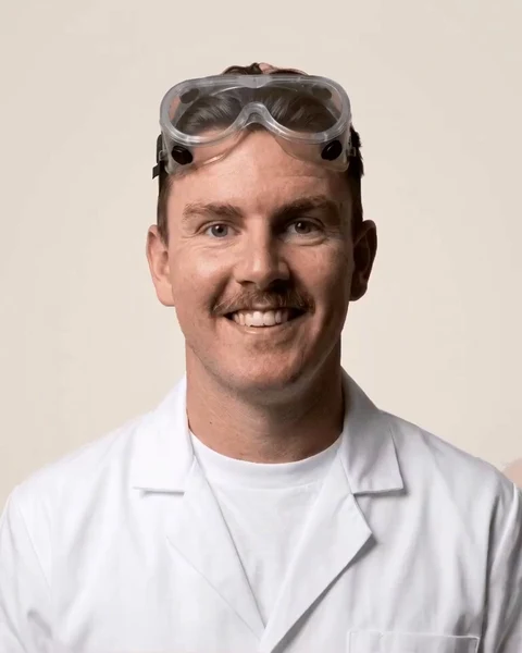
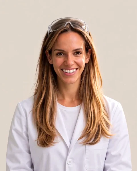
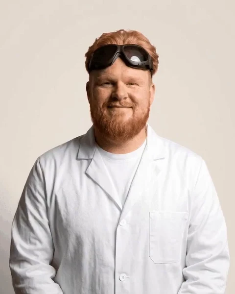
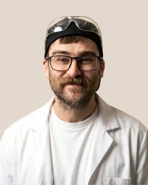
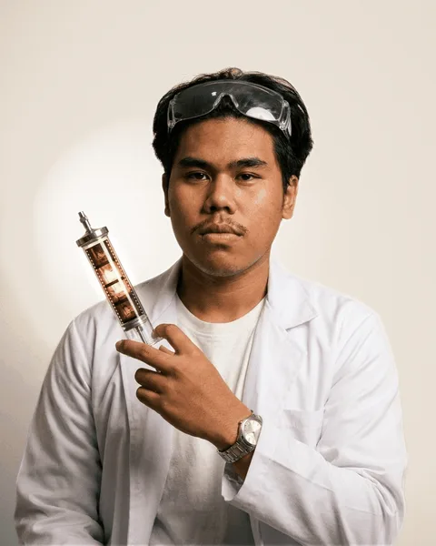
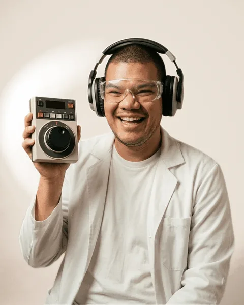
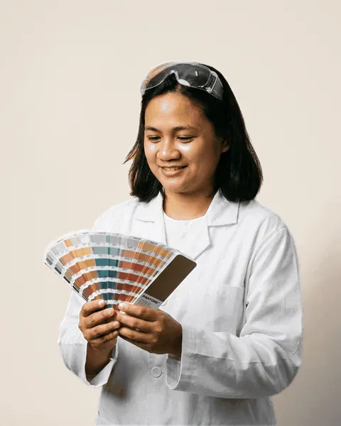
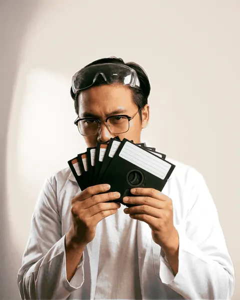
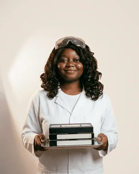
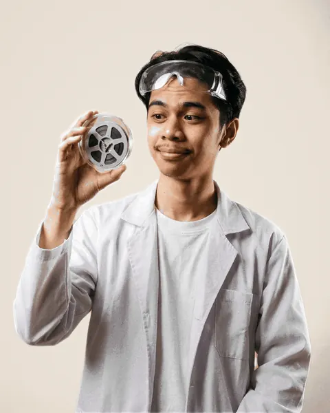
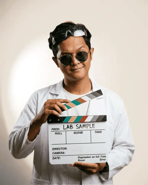
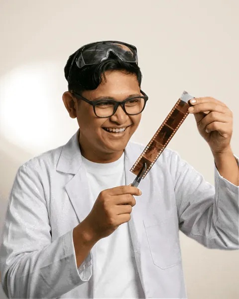
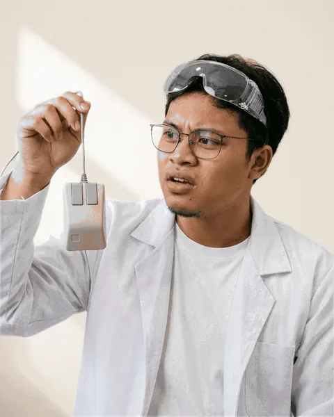
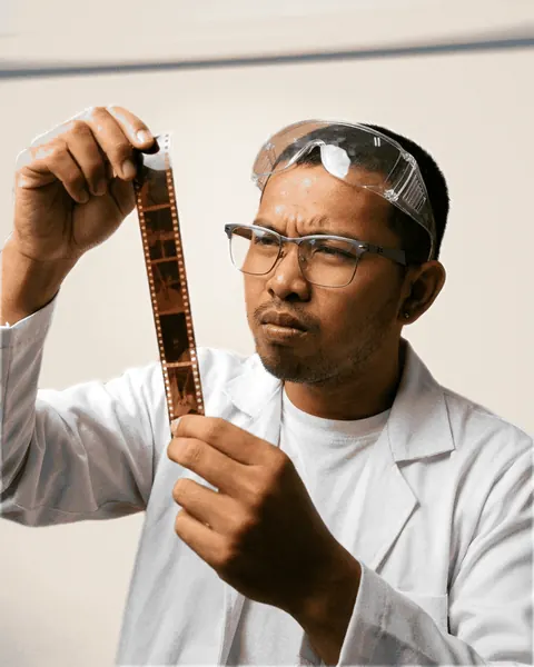
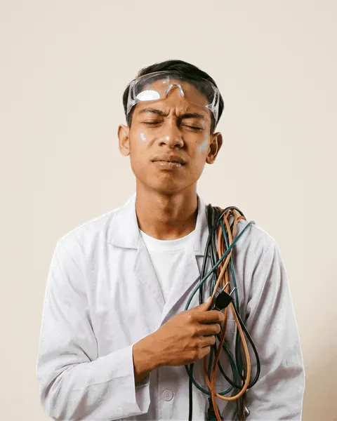
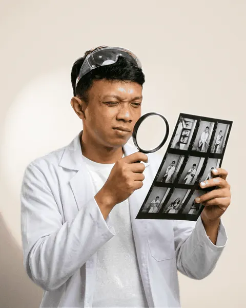
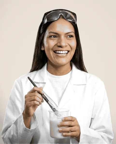
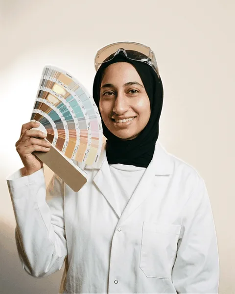
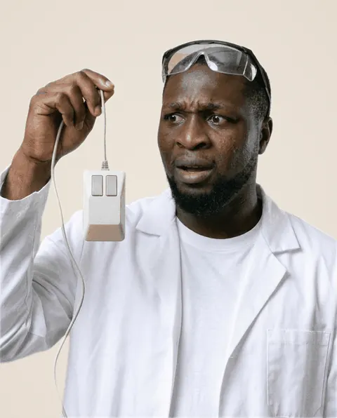
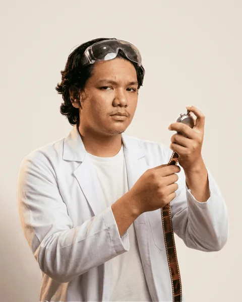
- The team are photographed in the lab: a white lab coat, often a prop of their job, on a plain warm cream backdrop. Warm and bright.
- Headshots and portraits are 4:5, always.
- A team loop film is a short silent loop of the same person in the same coat, 480 × 600 (4:5), as WebM and MP4 with a still poster; a small cut at 160 × 200.
- A film loops only when it is seen, never with sound, and never under reduced motion: the poster stands in.
- Client photos and films are their real jobs, their fitters and their vans. Never stock, never staged in a studio.
- Every clip is colour graded before anyone sees it, raw footage included, and stays warm and natural so it sits on paper.
- Never feature a client, their logo, ads or results while they are under NDA, or without their yes.
Drawn by hand
Cost per sale, not per lead.
not a lead. a sale.Case study- Anything a pharmacist would write by hand is biro: Caveat, in biro blue, slightly rotated, as if written on the page.
- A note points at one thing. Its arrow starts beside the note and ends at its part, never crossing words, another arrow or another mark.
- The highlighter marks the words that matter, drawn left to right as they come into view.
- Stamps and the seal are for verdicts: Hiring, Case study, New film, Recalled, Approved. Set at an angle, as if pressed by hand.
- Depth is a hard ink shadow, offset down and right. No blur, no soft drop shadows.
Layout and spacing
- Generous whitespace. A section breathes; if a piece feels full, split it in two rather than shrinking the type.
- Square corners on everything. The only round things are pills.
- Outlines are ink, 1.5 to 2px. Cards carry a hard ink shadow.
- Every section opens with a ruled header: its number, its kicker in mono, then the headline and its serif aside.
- Mobile first: everything reads at 390px wide, with nothing cropped and no sideways scroll.
- Paragraphs are never squeezed into a narrow column.
Motion
- Light and smooth.
- Numbers count up the first time they are seen.
- Charts draw in, and the highlighter and the biro write themselves in.
- A card that is one link tilts toward the pointer and springs back; a hero's art drifts a little as you scroll.
- Under reduced motion, all of it stops: figures show at once, films show their poster, nothing drifts or tilts.
Voice and tone
- Plain British English. Short sentences. Say what happens and who does it.
- Confident: state it. No hedging ("we aim to", "might", "hopefully"), no jargon, no buzzwords.
- Headlines make a point, not a topic.
- We sound like a lab: a pharmacy that sells growth. The joke is the pharmacy, never the client.
- A plain label first; the lab flavour in the line under it. Someone skimming must never have to decode a joke.
- The installers we work for are clients, always: never "subjects".
The lab’s words
- Autopsy
- The sales call: we take apart an installer's marketing. "Book an autopsy".
- Protocol
- How we work, start to finish.
- Trials
- Results and case studies.
- Licensed to deal
- Our guarantees.
- Lab notes
- Guides, videos and free resources.
Plain label, lab line
Copy rules
- Figures are live and dated. Every number comes from the live data and says when it was true ("as of 3 Nov 2026"). Never typed from memory, never rounded up, never invented.
- A figure still to fill is marked as a placeholder, in biro, until it is filled in.
- A client's result is only what they have stated, word for word.
- Never say where our figures come from: no naming the tools or systems they are read from.
- Never feature a client, their name, logo, ads or results while they are under NDA, or without their yes.
- Money in pounds with commas: £71,000. Add "+ VAT" wherever a price is quoted ex VAT.
- The offer and both guarantees have one wording, kept in one place; never paraphrase them.
- Write to one reader as "you". The first line under a headline is about them, not us.
- Every call to action says what happens next and how long it takes.
- Every bio has one plain line on what the person does for the reader before any joke. No jokes about money, mistakes, shouting or names.
- Careers copy states the pay first.
- "/ month", never "a month" or "per month".
Do and don’t
The name
DoOn steroids
Don’tSolar on Steroids · ON STEROIDS in a sentence · SoS
A headline
DoVideo ads cut from your own jobs.
Don’tInnovative full-funnel marketing solutions
Confidence
DoFresh creative every week.
Don’tWe aim to try to refresh creative where possible.
A figure
Do£71,000 completed revenue on under £3,000 of ad spend (as the client states it)
Don’tThousands of leads! Huge ROI!
The data
DoEvery sale fed back to Facebook.
Don’tPulled live from our CRM and project tool.
A call to action
DoBook an autopsy
Don’tSchedule a free no-obligation consultation today
Colour
DoOne pastel, on paper, outlined in ink.
Don’tA gradient, a new blue, or five pastels fighting.
For other tools
The same guidelines, word for word, for an agent, an LLM or a designer’s tool to read.